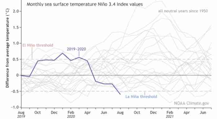
Last week, the Global Warming policy Forum headlined “La Nina Is Here”. Why the headline? Because the warming El Nino is over and the change to the La Nina represents cooling. Like seasonal and actual climate change it is a regular event. Which in physics means logical and predictable. And some cooling is showing up in various charts. Well, in the ones not altered by climate promoters.
Can you imagine having any number of computer “models” predicting “tipping points” and out-of-control warming, but it never happens? Actually, in order to avoid unacceptable self-doubting, the climate-hysteria community then spends even more computer time altering the actual temperature record.
To fit their failing hypothesis.
Tony Heller and his new colleague, Kirye, regularly show how fraudulent the promotion has been. Basically, the control freaks theme has been “Here is a frightening story!” “I can fix it.” “Please send money and do as you are told.”
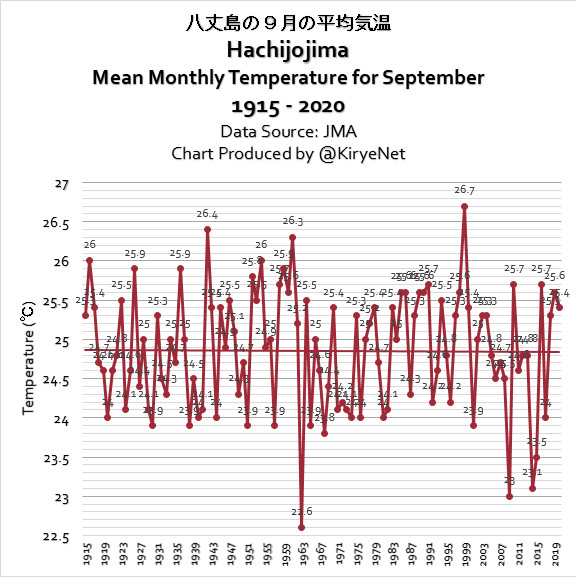
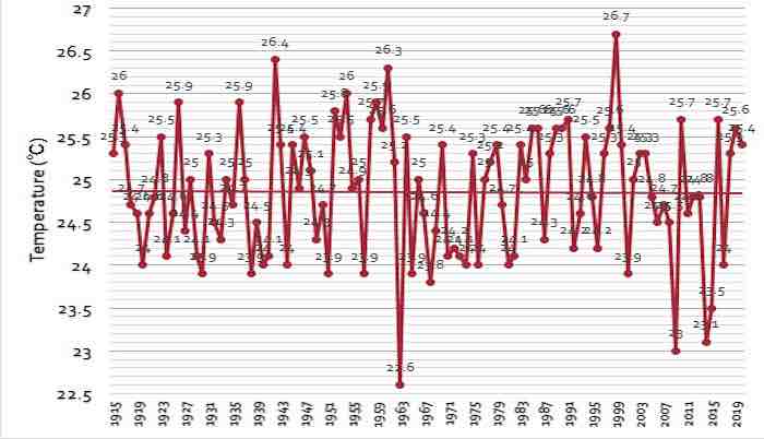
The following chart is by Kirye and it records the temperature at a station on a small island off of Japan. It begins in 1915 and suffers no urban heating. Note the flat trend.
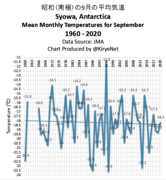
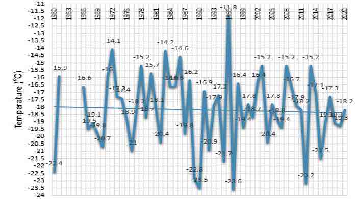
And then the chart on Antarctic Temps for September from 1960 to current.
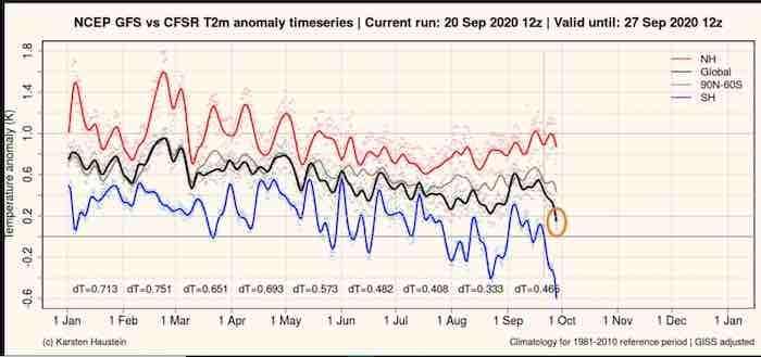
Naturally, charts for September are being updated. This one records various temperature series since January this year to date. The decline in the Southern Hemisphere’s winter is noteworthy, as are some headlines.
Of course, it always helps to have reports from the field:
“Record-Breaking Freeze in Queensland” – WeatherZone, September 27.
“Spring Storm Brings Snow to New Zealand Beaches” – The Guardian, September 28.
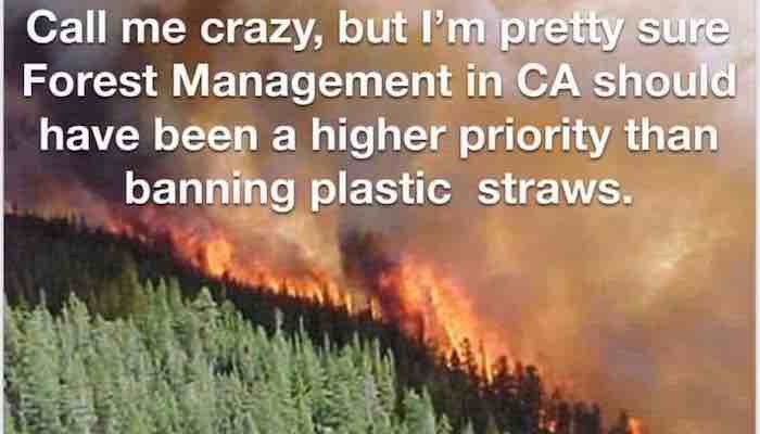
Over on the warming side, there have been sensational stories about wildfires in California and Oregon. These were due to exceptional outflow winds from the interior. The already hot air experiences adiabatic heating as it gets compressed going through the mountains.
It is worth looking up as well as noting that adiabatic heating of a gas has little to do with the characteristics of carbon dioxide.
Weather violence is caused by local differences in temperature.
Canada contains the world’s third largest mass of forests, amounting to some 9 percent of all forests. Should any hyper-sensitive person read this, please rest easy that the open grasslands of the Prairies were not caused by clear-cut logging. It’s climate and geography.
However, just north are seemingly endless trees extending roughly 7,000 kms from British Columbia on the Pacific to Labrador on the Atlantic.
And most of this is called a boreal forest and here is a chart of the severity of forest fires. As recorded by province this season is well below average. Perhaps low enough to merit some headlines?
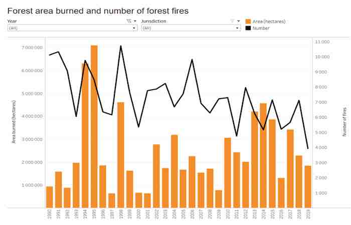
The following chart records Forest Area Burned and the Number of Fires, since 1990. Obviously, funding and marching orders for BLM and Antifa do not extend to torching Canada’s boreal forests
Putting sarcasm aside, one of the features of declining solar cycles has been global cooling along with increasing cloud cover.
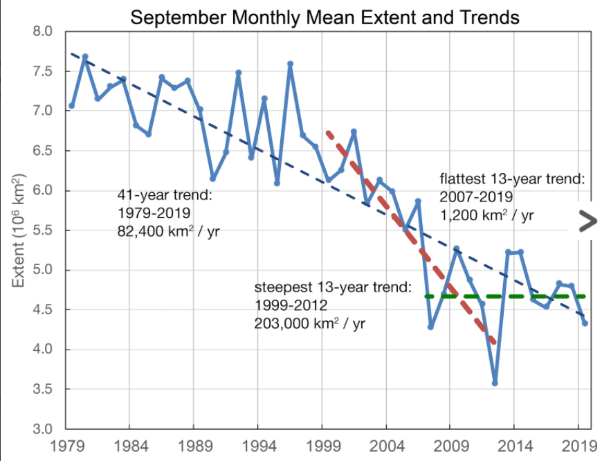
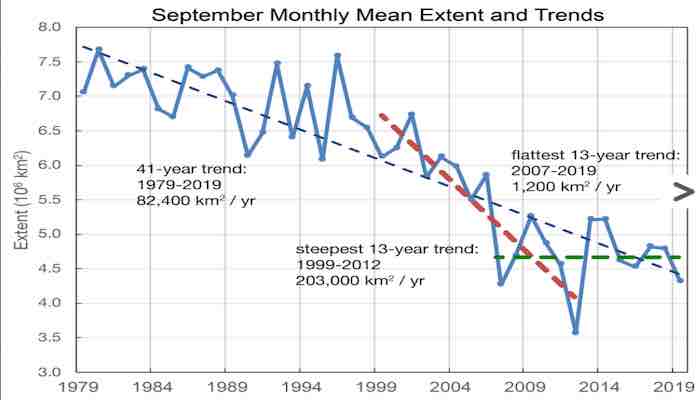
Typically, the low for Arctic sea ice extent occurs in September and the following is the update for this year. Note the possible change to a flat-lying trend over the past 13 years. (Source: NSIDC Boulder)
And to end on an ironical note, the last image is:
Bob Hoye (BobHoye.com) has been researching investments for decades, which eventually included the history of financial and political markets. He considers now to be the most fascinating time for both since the Great Reformation of the 1600s. Bob casts a caustic eye on all promotions and, having a degree in geophysics, is severely critical of the audacity that a committee can “manage” not just the economy, but also the temperature of the nearest planet. He has had articles published in major financial journals and, as a speaker, has amused assemblies in a number of cities, from London to Zurich to Tokyo.



 Naturally, charts for September are being updated. This one records various temperature series since January this year to date. The decline in the Southern Hemisphere’s winter is noteworthy, as are some headlines.
 Of course, it always helps to have reports from the field:
“Record-Breaking Freeze in Queensland” – WeatherZone, September 27.
“Spring Storm Brings Snow to New Zealand Beaches” – The Guardian, September 28.
Of course, it always helps to have reports from the field:
“Record-Breaking Freeze in Queensland” – WeatherZone, September 27.
“Spring Storm Brings Snow to New Zealand Beaches” – The Guardian, September 28.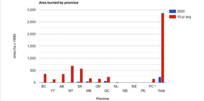
 Typically, the low for Arctic sea ice extent occurs in September and the following is the update for this year. Note the possible change to a flat-lying trend over the past 13 years. (Source: NSIDC Boulder)
 And to end on an ironical note, the last image is: