Train Smash—Chapter 4
Conditions for a train smash in the financial markets continue to build

News on the Net Brian Bloom, Bio and Archives--February 6, 2011
American Politics, News | Comments | Reader Friendly | Subscribe | Email Us
Summary
For those who have the eyes to see, conditions for a train smash in the financial markets continue to build. This conclusion does not flow from a predisposition on the part of this analyst to be pessimistic. It flows from the facts--some of which have been highlighted in the three previous editorials of this name, and some of which are presented below.
At the peak of the boom it was estimated that 70% of the US's GDP was driven by consumer spending. The reader should remember that a "consumer" is typically someone who is employed and who, therefore, has a disposable income. Those who are not employed and those who, for example, augment their income with green stamps, are really just disguised conduits for government spending to reach the market place. According to the most recent data published by the Bureau of Labour Statistics (BLS), January 2011 unemployment in the USA fell to 9% in January 2011. (See: bls.gov/)
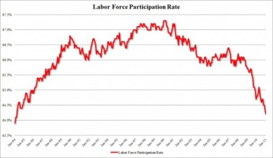 The above statistic needs to be seen in context of the bigger picture. The following chart was derived from statistics published the BLS
Whilst the unemployment rate in January 2011 was reported at 9% (down 1% from Q4 2009) , the labour force participation rate was 64% (down from 65% a year earlier)
So, if the unemployment rate was 9%, this begs the question: 9% of what?
To understand what is really happening, it is necessary to dig below the surface of the statistics.
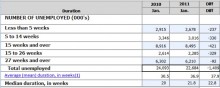
The first Table below shows that unemployment [supposedly] fell by 1.4 million between Jan 2010 and Jan 2011.
The above statistic needs to be seen in context of the bigger picture. The following chart was derived from statistics published the BLS
Whilst the unemployment rate in January 2011 was reported at 9% (down 1% from Q4 2009) , the labour force participation rate was 64% (down from 65% a year earlier)
So, if the unemployment rate was 9%, this begs the question: 9% of what?
To understand what is really happening, it is necessary to dig below the surface of the statistics.
The first Table below shows that unemployment [supposedly] fell by 1.4 million between Jan 2010 and Jan 2011.
Table 1: Total unemployed as presented by Government statistics
 Source: bls.gov
Note, however, that the average period of unemployment has lengthened. The average time for total unemployment has risen from 30.9 weeks to 37.9 weeks.
Also, over 6 million people looking for jobs have been unemployed for more than 27 weeks and the size of that category contracted the least. That is not a healthy sign. It means that the long term unemployed are falling by the wayside.
Also note that the total of unemployed--as per this table--was 22.6 million as at January 31st 2011.
However, this is not the information from which the unemployment percentage is derived. For that we have to look at Table 2 below, reconstructed from BLS numbers
Source: bls.gov
Note, however, that the average period of unemployment has lengthened. The average time for total unemployment has risen from 30.9 weeks to 37.9 weeks.
Also, over 6 million people looking for jobs have been unemployed for more than 27 weeks and the size of that category contracted the least. That is not a healthy sign. It means that the long term unemployed are falling by the wayside.
Also note that the total of unemployed--as per this table--was 22.6 million as at January 31st 2011.
However, this is not the information from which the unemployment percentage is derived. For that we have to look at Table 2 below, reconstructed from BLS numbers
 Source: ftp://ftp.bls.gov/pub/suppl/empsit.cpseed1.txt
Calculation of unemployment as at Q4 2010
14,801/153,867 = 9.6% (As at December 2010)
Note that the difference in the totals of the two tables above is:
22,684 (as at January 2011)--14,804 (as at December 2010) = 7,880
As aside, note also that in the statistics from which the numbers in Table 2 were extracted, there is a separate reference to "persons who currently want a job" as at December 30th 2010 of: 6,333. I could find no explanation of what this latter number meant i.e. There was no explanation regarding whether these latter people were part of the officially unemployed or in addition to the officially unemployed.
Source: ftp://ftp.bls.gov/pub/suppl/empsit.cpseed1.txt
Calculation of unemployment as at Q4 2010
14,801/153,867 = 9.6% (As at December 2010)
Note that the difference in the totals of the two tables above is:
22,684 (as at January 2011)--14,804 (as at December 2010) = 7,880
As aside, note also that in the statistics from which the numbers in Table 2 were extracted, there is a separate reference to "persons who currently want a job" as at December 30th 2010 of: 6,333. I could find no explanation of what this latter number meant i.e. There was no explanation regarding whether these latter people were part of the officially unemployed or in addition to the officially unemployed.
Interim conclusion # 1
Table 1 above shows that total unemployed fell by 1.4 million between January 2010 and January 2011. That is the number being trumpeted in the media. However, as can be seen from Table 2, the net year-on-year jobs lost by the Civilian work force between Q4 2009 and Q4 2010 rose by 1.0 million One implication of this is that 2.4 million jobs were created in the month of January 2011. Another implication is that the government statistics are not believableInterim Conclusion #2
If one accepts the latter as being more probable and if one bears in mind that 70% of the US's GDP was being driven by consumers, then the rational conclusion one must come to is that any GDP growth being experienced within the USA is being driven by government spending. Now let's look at what the US Government has been doing. First of all, let's understand the size of the US GDP. The most recently available number is $14.7 trillion (see: wikipedia.org ) In the year from January 1st to December 30th 2010, the US Public Debt rose from $12.3 trillion to $14.0 trillion, or by: $1.7 trillion = 11.5% of the 2010 GDP. Source: treasurydirect.govInterim Conclusion #3
The US Government borrowed the equivalent of 11.5% of 2010's GDP and the net effect of its having spent all this money was that 1 million jobs were lost in 2010. So where did the money go? Well, some of it went directly into the pockets of unemployed and underemployed "consumers" who acted as conduits for the cash to reach the market place. Some of it went into the world's financial markets, which boomed; and some of it went into the commodities markets, which boomed. For example, below is a 12 month chart of the $SPX to January 2011 (courtesy Bigcharts.com)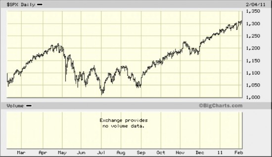
- The SPX rose from roughly 1,050 to roughly 1,300 (24%)
- The gold price rose from roughly $1,050 per ounce to $1,350 per ounce (29%)
- The oil price rose from roughly $76 a barrel to $88 a barrel (16%)
- The $CRB (Commodities Index) rose from roughly 270 to roughly 340 (26%)
Interim Conclusion #4
A meaningful proportion of the US government's borrowings went into the financial markets. It did not go into wealth creation activities. It went into assets--supposedly as a means of hedging against inflation. Except that the one hard asset that did not benefit (the one that is most meaningful to consumers who "drive" the economy) was domestic real estate. Quote regarding the Case Schiller Index of House Prices through November 2010: "The 10-City Composite was down 0.4% and the 20-City Composite fell 1.6% from their November 2009 levels." (Source: standardandpoors.com ) Now we come to a disconnect in logic It is generally accepted that US corporate earnings have been growing strongly. This evidenced by the fact that Price:Earnings ratios have been falling even as the market has been rising, as can be seen from the Chart below, courtesy Decisionpoint.com.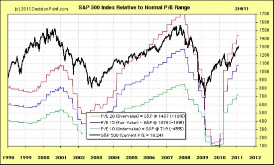 So this begs the question: If the money went primarily into assets and there was a net loss of jobs then what drove corporate earnings? Something is off centre here.
To catch a crook you have to think like a crook. Could something crooked have been going on behind the scenes?
The pesky fact is that rising profits do not necessarily translate to rising cash flows. If, for example, a CEO of a corporation decided to wipe off accumulated losses in 2009 with a bookkeeping entry that contained large provisions, and then he/she reversed some of those provisions in the 2010 year, profits would "appear" to have been increasing. But this "fact" would not necessarily be mirrored by increasing cash flows. One should bear in mind that CEO's are typically paid bonuses on some formula that relates to profit growth and share price growth--both of which can be manipulated in the manner described.
To analyse cash flows would be too complex a task for this analyst sitting on his own in his home office. However, dividend yields form a proxy for cash; because dividends have to be paid in cash.
Question: Have dividends been rising along with rising earnings?
Well, on November 21st 2008, the dividend yield (on the $SPX) was 3.51% (Source: investing.curiouscatblog.net )
On that date, the $SPX stood at 834.99.
Calculating cash dividends paid per share, we get:
3.5% of 834.99 = $29.22
As at yesterday (February 4th 2011), the $SPX stood at 1,310.87 and the dividend yield was 1.7% (Source: Decisionpoint.com)
1.7% of 1,310.87 = $22.28
Interim Conclusion #5
Whilst the earnings of the top 500 US corporations have supposedly increased since the bottom of the market in early 2009, the actual cash paid out by way of dividends has fallen from $29.22 per share to $22.28 or by 24%!
Yeah, yeah. I know. The market looks forward. The reason the market is "running" is that investors are looking ahead. Investors are anticipating profit growth.
So let's look forward.
If house prices are heading for a possible double dip, and job losses are increasing and, notwithstanding supposed increases in corporate profits, absolute cash dividends per share paid have actually fallen, what is going to drive the US economic growth going forward? Can the Federal Government continue to spruik the economy?
The first warning bell that rings is the Baltic Dry Goods Index, see chart below:
Source: http://investmenttools.com/futures/bdi_baltic_dry_index.htm
Baltic Exchange Dry Index (BDI),
"Logarithmic Chart"20 day exponential average in red.
200 day exp. avr. green
So this begs the question: If the money went primarily into assets and there was a net loss of jobs then what drove corporate earnings? Something is off centre here.
To catch a crook you have to think like a crook. Could something crooked have been going on behind the scenes?
The pesky fact is that rising profits do not necessarily translate to rising cash flows. If, for example, a CEO of a corporation decided to wipe off accumulated losses in 2009 with a bookkeeping entry that contained large provisions, and then he/she reversed some of those provisions in the 2010 year, profits would "appear" to have been increasing. But this "fact" would not necessarily be mirrored by increasing cash flows. One should bear in mind that CEO's are typically paid bonuses on some formula that relates to profit growth and share price growth--both of which can be manipulated in the manner described.
To analyse cash flows would be too complex a task for this analyst sitting on his own in his home office. However, dividend yields form a proxy for cash; because dividends have to be paid in cash.
Question: Have dividends been rising along with rising earnings?
Well, on November 21st 2008, the dividend yield (on the $SPX) was 3.51% (Source: investing.curiouscatblog.net )
On that date, the $SPX stood at 834.99.
Calculating cash dividends paid per share, we get:
3.5% of 834.99 = $29.22
As at yesterday (February 4th 2011), the $SPX stood at 1,310.87 and the dividend yield was 1.7% (Source: Decisionpoint.com)
1.7% of 1,310.87 = $22.28
Interim Conclusion #5
Whilst the earnings of the top 500 US corporations have supposedly increased since the bottom of the market in early 2009, the actual cash paid out by way of dividends has fallen from $29.22 per share to $22.28 or by 24%!
Yeah, yeah. I know. The market looks forward. The reason the market is "running" is that investors are looking ahead. Investors are anticipating profit growth.
So let's look forward.
If house prices are heading for a possible double dip, and job losses are increasing and, notwithstanding supposed increases in corporate profits, absolute cash dividends per share paid have actually fallen, what is going to drive the US economic growth going forward? Can the Federal Government continue to spruik the economy?
The first warning bell that rings is the Baltic Dry Goods Index, see chart below:
Source: http://investmenttools.com/futures/bdi_baltic_dry_index.htm
Baltic Exchange Dry Index (BDI),
"Logarithmic Chart"20 day exponential average in red.
200 day exp. avr. green
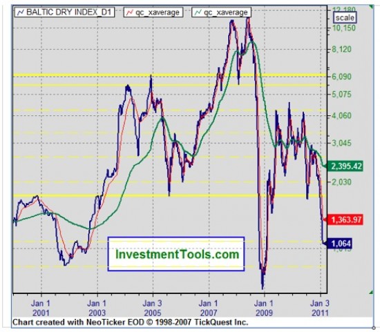 Readers should understand that the above chart does not reflect what the market expects of the future. The Baltic Dry Goods Index is not some form of derivative. It is a chart of current freight rates for shipping dry goods like coal, wheat, sugar and other dry commodities.
Clearly, if manufacturing countries are importing fewer raw materials then it stands to reason that the manufacturers in those countries--in the future--will be selling fewer finished goods.
This index peaked in 11,793 on May 20th 2008. As at February 4th 2011 it stood at 1,064. This is a fall of over 91%.
A 91% fall is hardly something that can be easily ignored by any thoughtful person.
Of course, one might argue that manufacturing countries are intending to reduce their stockpiles of raw materials (given that commodity prices have risen by 26% over the past year).
Okay, let's look at that. Let's assume that, in order to keep the prices of finished goods low, manufacturing countries are deliberately digging into stockpiles of low cost raw materials. Who is going to buy the finished goods?
For reasons already articulated, the only way sales of these finished goods are going to rise in the USA, as an example, is if the US Federal Government continues to borrow and spend.
Well, let's keep look forward. Let's look at what the market thinks about the potential for the US Government to continue borrowing and spending until hell freezes over.
First of all, let's look at the 30 year government bond yield (Chart courtesy Decisionpoint.com)
Readers should understand that the above chart does not reflect what the market expects of the future. The Baltic Dry Goods Index is not some form of derivative. It is a chart of current freight rates for shipping dry goods like coal, wheat, sugar and other dry commodities.
Clearly, if manufacturing countries are importing fewer raw materials then it stands to reason that the manufacturers in those countries--in the future--will be selling fewer finished goods.
This index peaked in 11,793 on May 20th 2008. As at February 4th 2011 it stood at 1,064. This is a fall of over 91%.
A 91% fall is hardly something that can be easily ignored by any thoughtful person.
Of course, one might argue that manufacturing countries are intending to reduce their stockpiles of raw materials (given that commodity prices have risen by 26% over the past year).
Okay, let's look at that. Let's assume that, in order to keep the prices of finished goods low, manufacturing countries are deliberately digging into stockpiles of low cost raw materials. Who is going to buy the finished goods?
For reasons already articulated, the only way sales of these finished goods are going to rise in the USA, as an example, is if the US Federal Government continues to borrow and spend.
Well, let's keep look forward. Let's look at what the market thinks about the potential for the US Government to continue borrowing and spending until hell freezes over.
First of all, let's look at the 30 year government bond yield (Chart courtesy Decisionpoint.com)
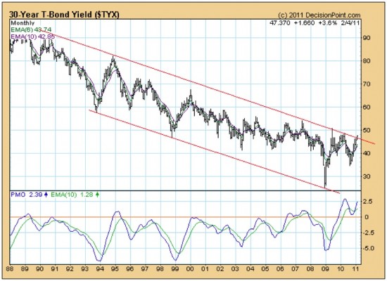 The eagle eyed reader will note that the yield is currently just peeping up above its 20 odd year falling trend line. Is the market perhaps saying: "Whoa there Tonto. We're not gonna just dole it out anymore"?
Perhaps more importantly, the Point & Figure chart of the ten year yield gave a "buy" signal on November 15th 2010 and the yield has continued to rise--with a target destination of 6.1% being anticipated (chart courtesy stockcharts.com)
The 10 year yield is clearly and unarguably in a rising trend
The eagle eyed reader will note that the yield is currently just peeping up above its 20 odd year falling trend line. Is the market perhaps saying: "Whoa there Tonto. We're not gonna just dole it out anymore"?
Perhaps more importantly, the Point & Figure chart of the ten year yield gave a "buy" signal on November 15th 2010 and the yield has continued to rise--with a target destination of 6.1% being anticipated (chart courtesy stockcharts.com)
The 10 year yield is clearly and unarguably in a rising trend
 Even more importantly, the ratio of the long dated yields to the short dated yields seems to be in a falling trend, as can be seen from the chart below (which is of the ratio of the 20 year yield and the five year yield and this represents one such example).
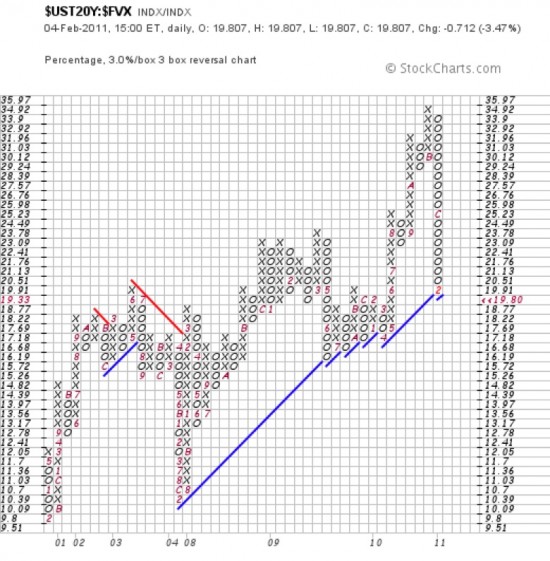 The ratio on the above chart is currently 19.8. If it should fall to 19.33 or less then the trend line will turn from blue (up) to red (down)
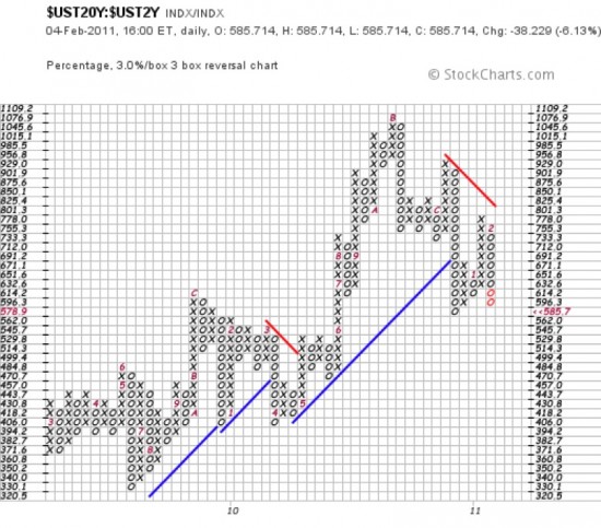
But, when you look at the chart of the ratio of the 20 year yield to the two year yield, you see a chart that is already in a falling trend.
The ratio on the above chart is currently 19.8. If it should fall to 19.33 or less then the trend line will turn from blue (up) to red (down)
But, when you look at the chart of the ratio of the 20 year yield to the two year yield, you see a chart that is already in a falling trend.
Interim Conclusion #6
Relatively speaking, short dated yields are rising faster than long dated yields. All of this begs the question: If the reason the equity market and the commodity markets are rising--as some very knowledgeable and experienced analysts are arguing--is that investors are anticipating inflation, then why are the longer dated yields rising at a slower pace than the shorter dated yields? Surely, if the market was expecting inflation, then the price of borrowings repayable in (say) 20 years time should be rising faster than the price of borrowings in (say) two years time? The answer, dear reader, is that the market is whispering that we might be headed for a period of capital (cash) shortages. Long dated yields are rising at a slower pace than short dated yields, not because investors are worrying about inflation, but because the markets are worrying about deflation. Is there any other clue that the markets could be expecting deflation? Yes, there is. Although the gold oriented investors are screaming that gold should skyrocket from here, the market is saying: "Hang on a minute. Not so fast." Theoretically, shares which form part of the $HUI index (emerging gold mines amongst them) are highly leveraged to the gold price. Theoretically, if the market looks forward and the market is expecting the gold price to rise, then the $HUI should be outperforming the gold price. The chart below is telling a story. It is a ratio of the $HUI to the gold price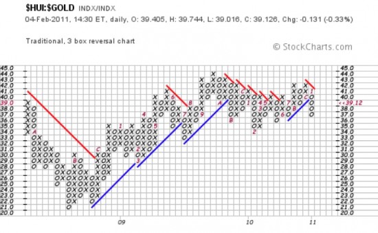 Note as a starter that the prevailing trend line is currently a downward pointing red line.
Of course, that might change if the gold price was to start rising. But doesn't the market look ahead?
In fact, the gold price chart gave a bullish signal just yesterday, as can be seen from the chart below
Note as a starter that the prevailing trend line is currently a downward pointing red line.
Of course, that might change if the gold price was to start rising. But doesn't the market look ahead?
In fact, the gold price chart gave a bullish signal just yesterday, as can be seen from the chart below
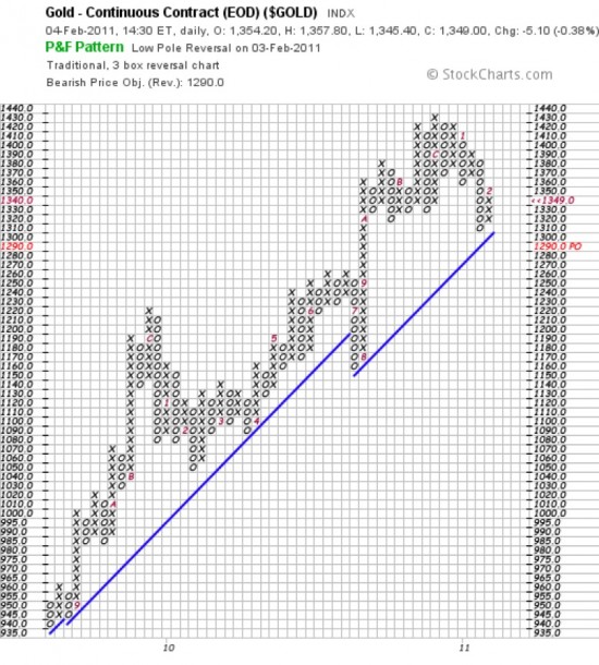 Realistically, the scale of this chart is oriented to trading. It is too short term oriented. Let's have a look at a chart that is oriented towards long term investment.
The chart below--a monthly chart of the gold price (courtesy decisionpoint.com)--shows a couple of worrying points:
Realistically, the scale of this chart is oriented to trading. It is too short term oriented. Let's have a look at a chart that is oriented towards long term investment.
The chart below--a monthly chart of the gold price (courtesy decisionpoint.com)--shows a couple of worrying points:
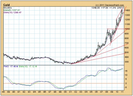 First, note how the PMO appears to be bouncing down from a highly elevated level that is lower than the previously highly elevated level.
Note also how the angle of incline of successive trend lines has been becoming progressively steeper. If the gold price rises above $1400 an ounce it will likely enter a parabolic blow-of phase. It could rise by hundreds if not thousands of dollars per month. But, clearly, given the lacklustre relative performance of the $HUI, the market is not expecting blow-off phase. In the short term, the gold price might rise as high as $1400.
But then what? What is the market expecting after that? Unfortunately, the current upward pointing trend line of the gold price chart is so steep that at any price below $1300 an ounce it will be penetrated on the downside.
And, if it is penetrated on the downside then it is likely that the market will be expecting the spectre of inflation to recede--because, under those circumstances, the gold price could fall by up to 20% and still be in a long term up trend (albeit less steeply rising).
Perhaps that is why long dated yields are not screaming up.
And, if the market is expecting the spectre of inflation to recede, then the only reason that the short term yields will be rising faster than long dated yields will be ...?
First, note how the PMO appears to be bouncing down from a highly elevated level that is lower than the previously highly elevated level.
Note also how the angle of incline of successive trend lines has been becoming progressively steeper. If the gold price rises above $1400 an ounce it will likely enter a parabolic blow-of phase. It could rise by hundreds if not thousands of dollars per month. But, clearly, given the lacklustre relative performance of the $HUI, the market is not expecting blow-off phase. In the short term, the gold price might rise as high as $1400.
But then what? What is the market expecting after that? Unfortunately, the current upward pointing trend line of the gold price chart is so steep that at any price below $1300 an ounce it will be penetrated on the downside.
And, if it is penetrated on the downside then it is likely that the market will be expecting the spectre of inflation to recede--because, under those circumstances, the gold price could fall by up to 20% and still be in a long term up trend (albeit less steeply rising).
Perhaps that is why long dated yields are not screaming up.
And, if the market is expecting the spectre of inflation to recede, then the only reason that the short term yields will be rising faster than long dated yields will be ...?
Conclusion
DeflationOverall Conclusion
If the stock markets and the commodity markets have been barrelling along because they have been expecting inflation and now the market is signalling the possibility of deflation, the logical conclusion must be that conditions for financial train smash continue to grow.Analyst observation
There is currently a lot of political posturing going on as to whether the Republicans will "allow" an increase in the Federal debt limit. The market is saying that it does not particularly care what the outcome of this posturing is. "We are gonna be circumspect about whether we are gonna lend you the money that you want to borrow. Going forward, we're gonna be circumspect about continuing to allow the Fed to just create more money out of thin air." I have been expecting this outcome for some years now--as can be seen from the very first article I ever posted on August 5th 2002. (see gold-eagle.com ) The core issue is that society's leaders have lost the plot. They have become so fixated on personal power (money and political influence) that they have allowed the world's economic infrastructure to decay--to say nothing of the physical environment. That is why I wrote Beyond Neanderthal--which provides a vision of a pathway to an alternative outcome. That is why I am writing The Last Finesse--which shows a nearer term practical way forward through the minefield of duplicity and skulduggery. The manuscript for The Last Finesse is expected to be completed by April 2011. If you have an interest in acquiring a copy, please email me with your contact details at info@beyondneanderthal.com and please specify whether you would prefer a hard copy or an e-book. Brian Bloom Author, Beyond Neanderthal and The Last Finesse. beyondneanderthal.comView Comments
News on the Net——Bio and Archives
News from around the world