By Sierra Rayne ——Bio and Archives--June 12, 2014
Global Warming-Energy-Environment | CFP Comments | Reader Friendly | Subscribe | Email Us
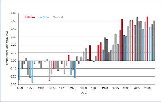
"'We saw record global temperatures in 1998, 2005, and again in 2010 when ongoing global warming was positively reinforced by El Nino events,' adds [Michael] Mann. 'There is a good chance we will see a global temperature record this year or next if a substantial El Nino event takes hold. That's bad news for climate skeptics. After all, by now we've all heard the claim that global warming has 'stopped' or is 'slowing down.' As we've explained before, this misleading assertion relies heavily on the fact that the year 1998 was a very, very warm year, due to a strong El Nino event. If you cherry-pick the beginning of your time series, and start with a very hot year, you can make it look as though global temperatures aren't rising so fast."The Mother Jones feature shows the following chart of "global temperature anomalies from 1950-2013" to make its case.
 This got me looking over to NOAA's Climate at Glance website and its annual global temperature anomalies. Here they are.
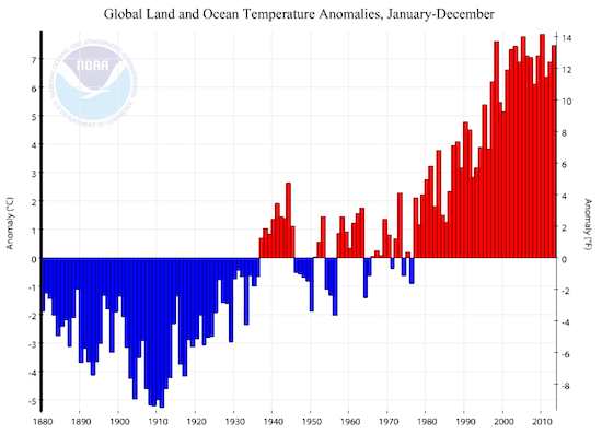 Oh my, do we have a major problem. According to the Mother Jones figure sourced from the "World Meteorological Organization [WMO]," global temperatures have increased by about 0.7 to 0.8°C since the coolest periods of the 1950s and 1970s (just subtract the temperature anomalies of the two periods you are interested in to get the global temperature change between them). Now look at the NOAA graph above, and particularly the y-axes. Apparently NOAA is telling us that global temperatures increased by about 10°C (i.e., more than an order of magnitude higher than the WMO data) since the coolest years of the 1950s.
First I thought this might be an artifact of NOAA's web graphing software, in that it just forgot to put in the decimal place (i.e., the +7°C values should be +0.7°C and the -5°C values should -0.5°C, etc.) to bring them more in-line with the WMO dataset. But no, the data in the table on NOAA's webpage below the figure shows the much higher values, as does the spreadsheet you can download.
But even ignoring these massive discrepancies, look at the relative magnitudes of various years between the WMO and NOAA global temperature datasets. The NOAA data shows the coldest years of the 1970s as still being much warmer than the coldest years of the 1950s, whereas the WMO global temperature data shows the coldest years during these two decades as being about equal. The datasets are clearly quite different for the same variable: global temperature.
I sent an e-mail to Derek Arndt at NOAA on June 11 regarding the apparent problems with their global temperature anomalies, and he replied with the following on the same day: "When we transitioned to the new web template earlier this week, the monthly components became summed, rather than averaged, into the annual value. In short, the anomalies presented need to be divided by 12 (the 60-month values by 60, etc.). We should deploy the corrected version tomorrow." Thus, by the time you read this article, the NOAA dataset may be corrected. Fine, but even if we divide all the values by 12, the patterns between the WMO and NOAA datasets over time remain different.
Moving on to the Australian Bureau of Meterology's global temperature dataset, more anomalies are evident in the global temperature anomaly.
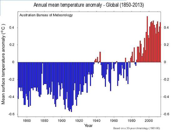 Note the El Nino year in 1998 for the Australian data. It is the warmest global temperature anomaly on record by a long shot. Now look at the WMO and NOAA datasets, which both show 1998 as only the third warmest year on record for global temperatures. Again, other differences exist between the Australian global temperature record compared to that of WMO and NOAA.
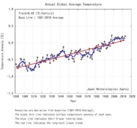
Japan's global temperature dataset is also different.
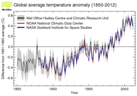
 The Met Office Hadley Centre and Climatic Research Unit (HadCRU) global temperature data tracks reasonably closely with NOAA and NASA's Goddard Institute for Space Studies (GISS), but there are some substantial differences before the 1970s, which the Met Office office discusses here.
 So when the climate alarmists suggest that global temperature estimates are a precise science, send them to these various websites. Take this statement from the Mother Jones article:
"We saw record global temperatures in 1998, 2005, and again in 2010 when ongoing global warming was positively reinforced by El Nino events."
According to NOAA, 2005 was slightly warmer than 1998, and 2010 was slightly warmer than 2005, suggesting a sequence of record-breaking as we move from 1998 to 2005 to 2010. NASA has the same pattern, but indicates that 1998 was much cooler than 2005. The Australian data suggests that 1998 was warmer than 2005, and even that 2005 was warmer than 2010. Japan's data suggests 1998 was warmer than 2010, and 2010 was warmer than 2005, but that 2013 was warmer than 2010 (yet still cooler than 1998). Figure all that out. Ask five people each the same question, and get eight different answers.
HadCRU (in their HadCRUT4 series) does the right thing and includes 95% confidence intervals (shown in parentheses) on their global temperature anomaly estimates: 1998, 0.53°C (0.44 to 0.62°C); 2005, 0.54°C°C (0.45 to 0.63°C); and 2010, 0.55°C (0.46 to 0.64). The 95% confidence intervals are ¬±0.09°C on either side of each year's global temperature estimate, and the difference between the 1998 and 2005 estimates is only 0.01°C while the difference between the 2005 and 2010 estimates is also only 0.01°C. To recap, the 95% confidence intervals are ¬±0.09°C for each estimate and the difference between each estimate is only 0.01°C. My confidence that 2005 and 2010 were actually warmer than 1998 with any level of statistical significance is low.
All this explains why the public shouldn't get too excited when some climate agency claims we set a new temperature record. Remember those claims that July 2012 was the hottest ever in the United States? They fell apart once NOAA subsequently revised their dataset and concluded that July 1936 was the hottest on record, kicking July 2012 out of the supposed top spot. Of course, NOAA also doesn't provide error bars on its regional or national temperature estimates. Not good. Regional, national, and international temperature estimates are just that -- estimates. They are not exact numbers with no error, and when comparing multiple periods we need to know that error in order to test whether the estimated temperatures for the two periods are, in fact, actually different with any basic level of statistical confidence.
Mother Jones accuses critical thinkers of cherry-picking global temperature trends in an attempt to show that global temperatures aren't increasing when they actually are. Wrong.
Using non-parametric methods, there has been no significant trend in global temperatures using the NOAA dataset since 1996. With parametric regression, there has been no trend since 1997. If we leave out the El Nino year of 1998 and start our analysis in 1999, there has also been no significant trend in global temperatures since 1999 using either non-parametric or parametric approaches. The correlation in global temperatures since 2001 is actually negative! To accuse those stating that global temperatures have not exhibited a significant trend for at least 13 years, and more likely for up to 18 years, of cherry-picking is pure nonsense and anti-science.
The Australian global temperature dataset shows no significant trends since either 1994 or 1995 depending on the statistical analysis. Two decades with no significant trend.
There is little doubt about it. Global warmed has indeed stopped -- for almost two decades and counting.
So when the climate alarmists suggest that global temperature estimates are a precise science, send them to these various websites. Take this statement from the Mother Jones article:
"We saw record global temperatures in 1998, 2005, and again in 2010 when ongoing global warming was positively reinforced by El Nino events."
According to NOAA, 2005 was slightly warmer than 1998, and 2010 was slightly warmer than 2005, suggesting a sequence of record-breaking as we move from 1998 to 2005 to 2010. NASA has the same pattern, but indicates that 1998 was much cooler than 2005. The Australian data suggests that 1998 was warmer than 2005, and even that 2005 was warmer than 2010. Japan's data suggests 1998 was warmer than 2010, and 2010 was warmer than 2005, but that 2013 was warmer than 2010 (yet still cooler than 1998). Figure all that out. Ask five people each the same question, and get eight different answers.
HadCRU (in their HadCRUT4 series) does the right thing and includes 95% confidence intervals (shown in parentheses) on their global temperature anomaly estimates: 1998, 0.53°C (0.44 to 0.62°C); 2005, 0.54°C°C (0.45 to 0.63°C); and 2010, 0.55°C (0.46 to 0.64). The 95% confidence intervals are ¬±0.09°C on either side of each year's global temperature estimate, and the difference between the 1998 and 2005 estimates is only 0.01°C while the difference between the 2005 and 2010 estimates is also only 0.01°C. To recap, the 95% confidence intervals are ¬±0.09°C for each estimate and the difference between each estimate is only 0.01°C. My confidence that 2005 and 2010 were actually warmer than 1998 with any level of statistical significance is low.
All this explains why the public shouldn't get too excited when some climate agency claims we set a new temperature record. Remember those claims that July 2012 was the hottest ever in the United States? They fell apart once NOAA subsequently revised their dataset and concluded that July 1936 was the hottest on record, kicking July 2012 out of the supposed top spot. Of course, NOAA also doesn't provide error bars on its regional or national temperature estimates. Not good. Regional, national, and international temperature estimates are just that -- estimates. They are not exact numbers with no error, and when comparing multiple periods we need to know that error in order to test whether the estimated temperatures for the two periods are, in fact, actually different with any basic level of statistical confidence.
Mother Jones accuses critical thinkers of cherry-picking global temperature trends in an attempt to show that global temperatures aren't increasing when they actually are. Wrong.
Using non-parametric methods, there has been no significant trend in global temperatures using the NOAA dataset since 1996. With parametric regression, there has been no trend since 1997. If we leave out the El Nino year of 1998 and start our analysis in 1999, there has also been no significant trend in global temperatures since 1999 using either non-parametric or parametric approaches. The correlation in global temperatures since 2001 is actually negative! To accuse those stating that global temperatures have not exhibited a significant trend for at least 13 years, and more likely for up to 18 years, of cherry-picking is pure nonsense and anti-science.
The Australian global temperature dataset shows no significant trends since either 1994 or 1995 depending on the statistical analysis. Two decades with no significant trend.
There is little doubt about it. Global warmed has indeed stopped -- for almost two decades and counting.View Comments
Sierra Rayne holds a Ph.D. in Chemistry and writes regularly on environment, energy, and national security topics. He can be found on Twitter at @srayne_ca